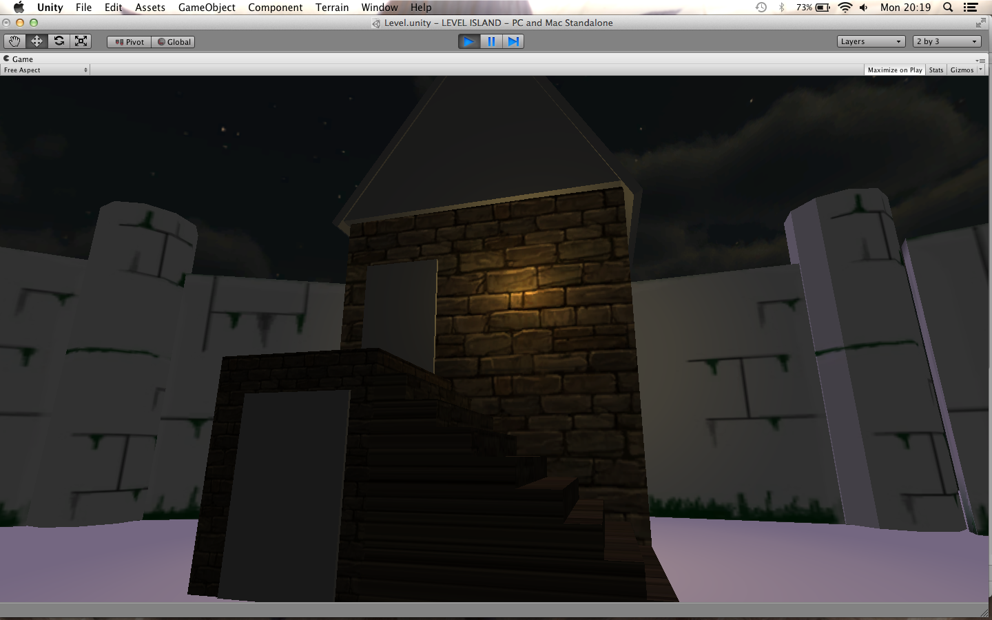
This image was inspired by the front gate of Windfall Island in the Legend of Zelda Series(as mentioned before). The idea is to have a starting area before heading to the main area of the level which is where the bonfire is shown in the next picture. I like this because it gives the opening part of the level a little bit of mystery however i have to be careful because it might give a different theme to the one I'm aiming for.
The main area is going to have a bonfire which will be main attraction, with stalls selling different items in a circle around the bonfire and then buildings behind the stalls. I went for this because it would make this area open and more friendly, also adding the bright colours which I have learnt from Yap Kun Rong.
The comments from my peers on this was that it would feel very abandoned without people in the level and the choice of music would be critical, but maybe adding lanterns to help illuminate the level and add more colour!
Secondly creating the objects for the level and texturing them.
I found this texture done by Frank Vanderwel on Google images and I absolutely love it because it fits with my idea of a medieval-ish festival and it's slightly cartoon like in Zelda Wind Waker but the level of detail is higher then Zelda and this is what i'm looking for my buildings.
In Maya I made 2 different types of building and then exported them into Unity.


House number 1
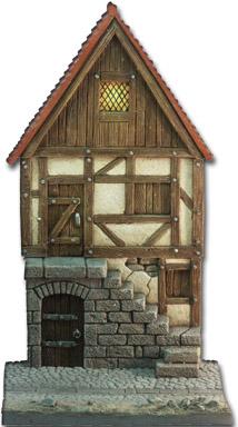
I found this model house in a model shop in Leeds. I got this image from their website and used it as a guide to model the first house, however I don't like the top half of the model house, therefore I decided to have all of the main building in the texture I found. The problem about this was the texture stretched really badly across the building and didn't cope well with stairs. I fixed this by using a UV snapshot of the building and placing the texture in the correct place.
House number 2
This one was inspired by my house back in Allerston because we have a awning at the front, also most little cafes and some shops have them as shown below.
I thought this was great idea combining the house and the shop to make the level more interesting.
I think by Extruding a lot of my objects to reduce polygon count is a definite because it will help my game run more smoothly.
I have also created the walls to keep the player from leaving, and made my own texture for it.
The texture is same as the ones i used in my concept art, because i don't want to use a lot of textures from random sources from Google.
UV mapping most of these objects/assets was easy apart from some the more complex designs.
UV mapping most of these objects/assets was easy apart from some the more complex designs.


No comments:
Post a Comment